Cảnh báo trong Bootstrap 4
Các thông điệp cảnh báo (alert) dùng để truyền thông tin đến người dùng về tình trạng của trang web hay kết quả của một hành động tương tác nào đó. Trong Bootstrap, các cảnh báo mặc định có gồm nhiều loại khác nhau và cũng như mỗi cảnh báo đều có màu sắc khác nhau.
Cảnh báo được tạo bằng lớp .alert theo sau là lớp ngữ cảnh: .alert-success, .alert-info, .alert-warning, .alert-danger, .alert-primary, .alert-secondary, .alert-light và .alert-dark.
<div class="alert alert-success">
    <strong>Success!</strong> This alert box could indicate a successful or positive action.
  </div>
Liên kết cảnh báo
Khi bạn muốn tạo liên kết cảnh báo trong thông điệp cảnh báo, bạn hãy thêm lớp .alert-link vào bất cứ liên kết nào bên trong thẻ đó.
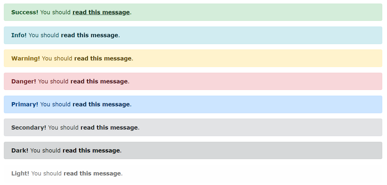
<div class="alert alert-success">
  <strong>Success!</strong> You should <a href="#" class="alert-link">read this message</a>.
</div>
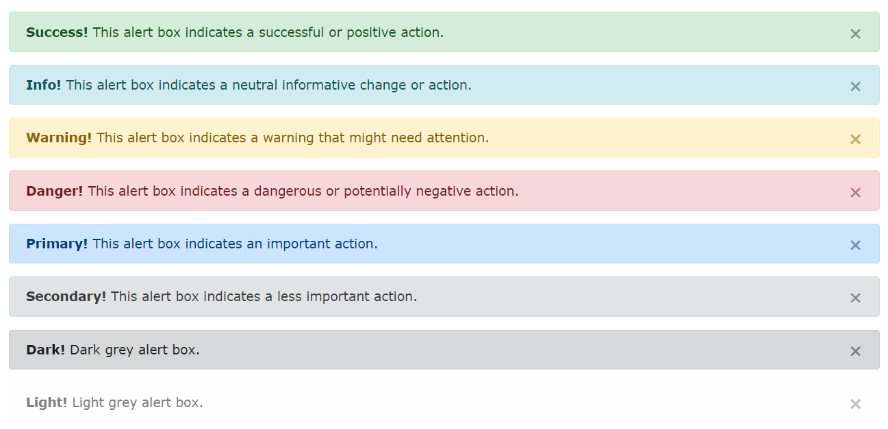
Đóng cảnh báo
Nội dung trình bày trong Alert có thể là các dòng text hoặc bất kỳ HTML nào, có thể kích hoạt JS để bấm vào một nút close đóng lại Alert bằng cách cho thêm thiết lập lớp .alert-dismissible mặc định hiện thị với lớp .fade .show. Sau đó bên trong cho thêm một nút bấm .close gán cho nó thuộc tính data-dismiss=”alert”.

<div class="alert alert-success alert-dismissible"> <button type="button" class="close" data-dismiss="alert">×</button> <strong>Success!</strong> Indicates a successful or positive action. </div>
Hiệu ứng hoạt hình cho cảnh báo
Trong lúc nhấn nút “x” đóng cảnh báo, bạn có thể thêm 1 số hiệu ứng hoạt hình làm cảnh báo dần mờ đi bằng cách thêm lớp .fade và .show theo ví dụ sau.
<!DOCTYPE html>
<html lang="en">
<head>
<title>Bootstrap Example</title>
<meta charset="utf-8">
<meta name="viewport" content="width=device-width, initial-scale=1">
<link rel="stylesheet" href="https://maxcdn.bootstrapcdn.com/bootstrap/4.5.0/css/bootstrap.min.css">
<script src="https://ajax.googleapis.com/ajax/libs/jquery/3.5.1/jquery.min.js"></script>
<script src="https://cdnjs.cloudflare.com/ajax/libs/popper.js/1.16.0/umd/popper.min.js"></script>
<script src="https://maxcdn.bootstrapcdn.com/bootstrap/4.5.0/js/bootstrap.min.js"></script>
</head>
<body>
<div class="container">
<h2>Animated Alerts</h2>
<p>The .fade and .show classes adds a fading effect when closing the alert message.</p>
<div class="alert alert-success alert-dismissible fade show">
<button type="button" class="close" data-dismiss="alert">×</button>
<strong>Success!</strong> This alert box could indicate a successful or positive action.
</div>
<div class="alert alert-info alert-dismissible fade show">
<button type="button" class="close" data-dismiss="alert">×</button>
<strong>Info!</strong> This alert box could indicate a neutral informative change or action.
</div>
<div class="alert alert-warning alert-dismissible fade show">
<button type="button" class="close" data-dismiss="alert">×</button>
<strong>Warning!</strong> This alert box could indicate a warning that might need attention.
</div>
<div class="alert alert-danger alert-dismissible fade show">
<button type="button" class="close" data-dismiss="alert">×</button>
<strong>Danger!</strong> This alert box could indicate a dangerous or potentially negative action.
</div>
<div class="alert alert-primary alert-dismissible fade show">
<button type="button" class="close" data-dismiss="alert">×</button>
<strong>Primary!</strong> Indicates an important action.
</div>
<div class="alert alert-secondary alert-dismissible fade show">
<button type="button" class="close" data-dismiss="alert">×</button>
<strong>Secondary!</strong> Indicates a slightly less important action.
</div>
<div class="alert alert-dark alert-dismissible fade show">
<button type="button" class="close" data-dismiss="alert">×</button>
<strong>Dark!</strong> Dark grey alert.
</div>
<div class="alert alert-light alert-dismissible fade show">
<button type="button" class="close" data-dismiss="alert">×</button>
<strong>Light!</strong> Light grey alert.
</div>
</div>
</body>
</html>
Dịch từ: https://www.w3schools.com/bootstrap4/bootstrap_alerts.asp
Đăng ký nhận bộ tài liệu học Java trên 2 trang giấy tại đây
Xem thêm: Java Coding Bootcamp là gì? Tổng quan về Java Coding Bootcamp


0 Lời bình